░░░░ 2018
DC11331
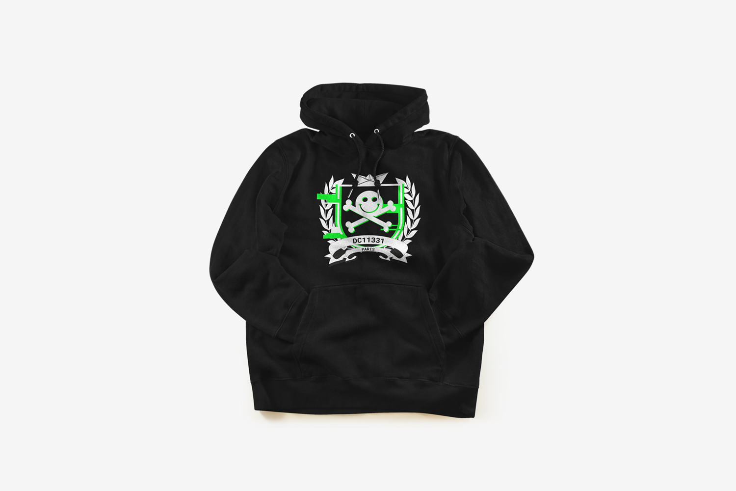
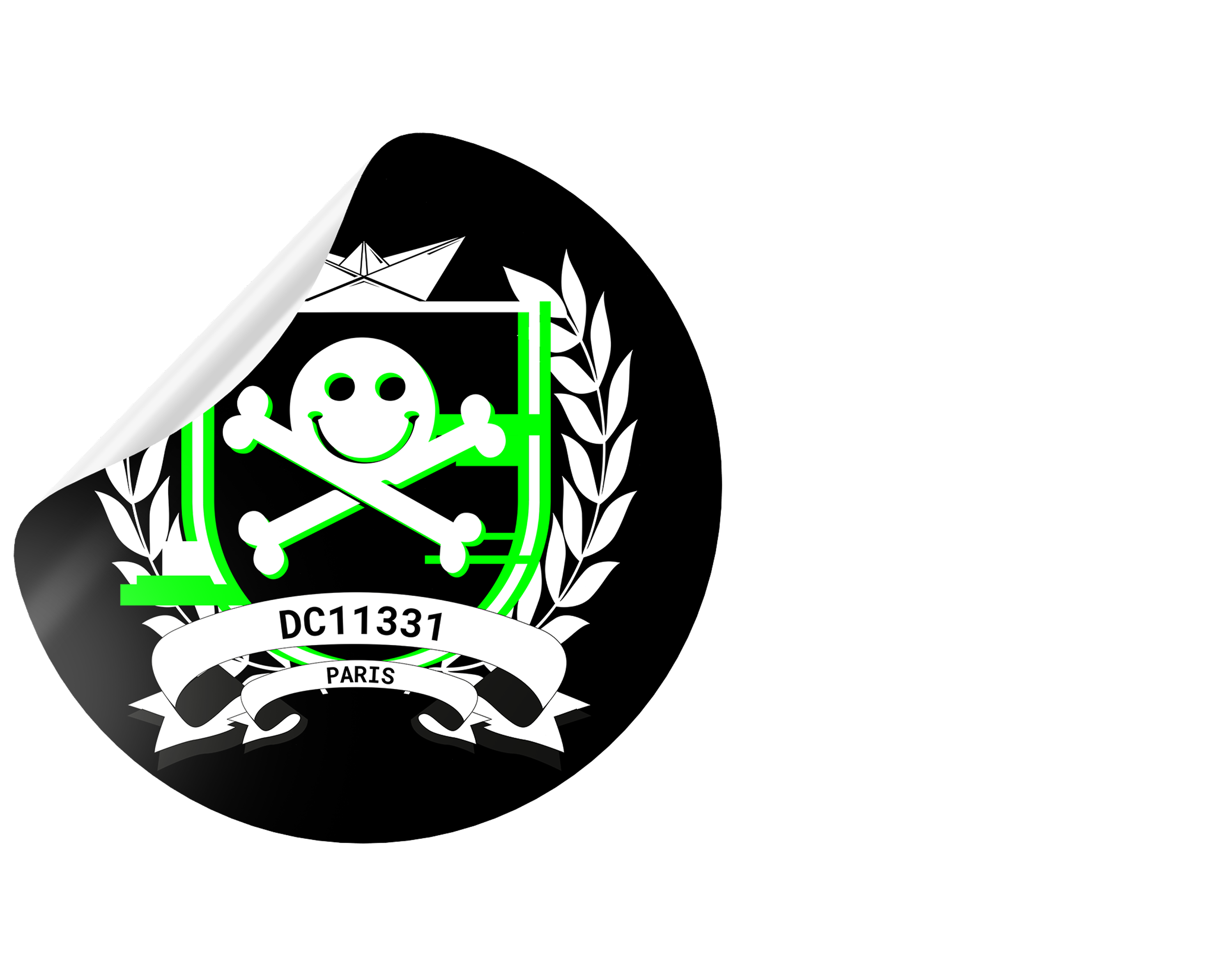
DC1131 is the French local group of the global DEFCON network. It organizes monthly cybersecurity events, including talks, technical challenges, and meetups—to strengthen the local infosec community. With its roots in underground culture, DEFCON is instantly recognizable by its iconic “smiley skull” symbol.
↘ About
░ As part of DC1131’s evolution, I was brought in to create a bold and cohesive visual identity that could unify the group’s communication and merch. The goal was to strike the right balance between hacker culture and visual clarity, something raw, functional, and distinctly recognizable.
↘ Objective
░ The visual language draws on DEFCON’s roots, monospaced type, glitch effects, black and white contrasts, while giving DC1131 its own distinct tone within the global network.
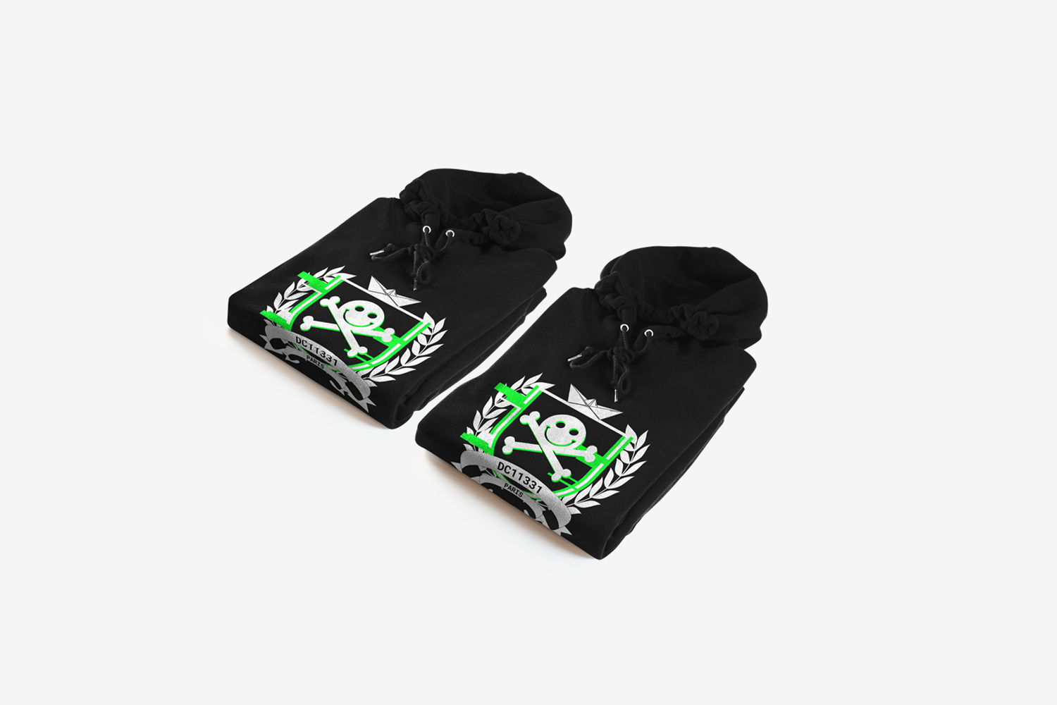
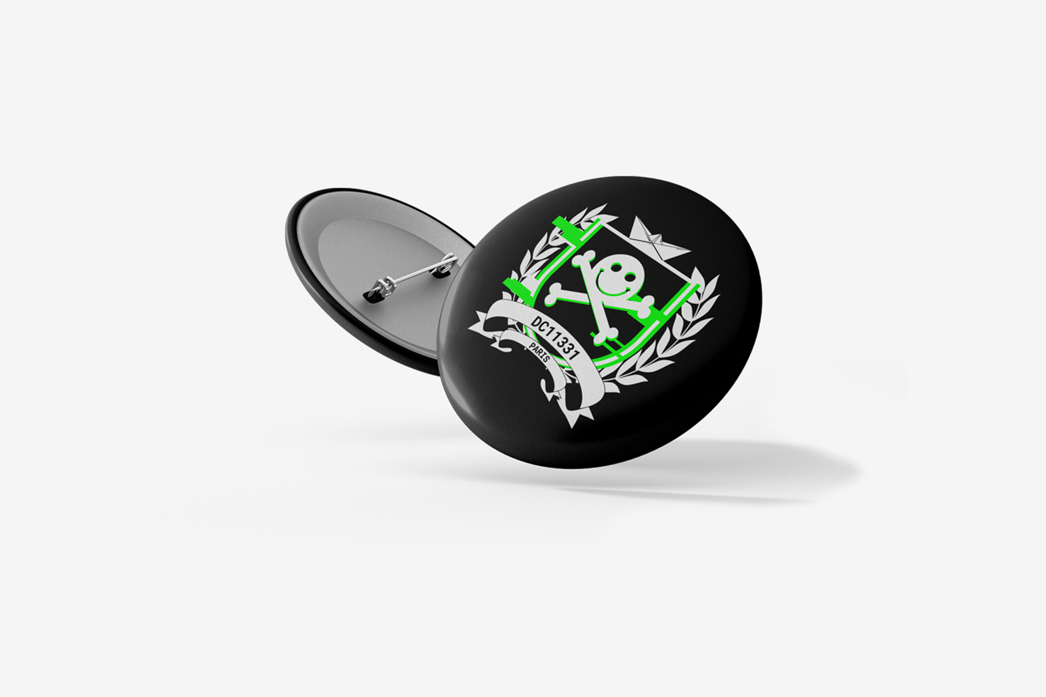
░ Merchandise such as hoodies, pins, and stickers was designed not only as branding but as symbols of group identity. These items help foster a sense of pride and belonging among members.
░ The identity had to be flexible enough to apply across recurring events and evolving formats. Guidelines were created to ensure consistency while allowing room for creative variation.
⮡ Gallery